How to Watermark Your Photos Without Ruining Them

Most people watermark their photos badly, and the reason is a misunderstanding rather than bad taste. They treat the mark as a lock, so they make it big and opaque, and end up with an image nobody wants to look at, let alone share. Watermarks aren’t locks. Understanding what they actually do is what lets you watermark your photos in a way that protects your work without wrecking it.
This guide covers the specific numbers that separate a professional mark from an amateur one: opacity by use case, the genuine trade-off in placement, how to design a mark that survives being small, and the situations where watermarking is the wrong call entirely.
What watermarks actually do (and don’t)
Start here, because everything else follows from it. A determined thief can crop, clone, or inpaint your watermark out in about two minutes, and AI removal tools have made that easier, not harder. If your mental model is “this prevents theft,” you’ll design something intrusive and still lose the file.
What watermarks reliably do is subtler and genuinely valuable:
- Stop casual reuse. Most unauthorized use isn’t malicious, it’s someone dragging an image into a blog post without thinking. A visible mark interrupts that impulse.
- Attribute your work as it travels. Images get separated from their captions constantly. The mark travels with the pixels.
- Drive traffic back. A handle or domain on the image turns every repost into a signpost, which is why photographers who mark their work see referrals from places they never posted to.
- Protect unfinished work. Client proofs and previews are the one case where a heavier mark is entirely justified: it isn’t paid for yet.
The opacity numbers that matter
This is where most guides say “keep it subtle” and stop. Subtle is not a setting. These ranges come from how the mark will be used:
|
Use case |
Opacity |
Why |
|
Portfolio & social posts |
25–35% |
Visible on inspection, invisible to enjoyment |
|
Stock & licensed previews |
35–50% |
Must survive removal attempts, still presentable |
|
Client proofs & unpaid work |
40–55% |
Deliberately obstructive until invoiced |
|
Print & delivered files |
0% |
Never watermark work the client paid for |
In practice I’d start at 30% for anything public-facing and adjust by image rather than by rule, because a mark at 30% reads very differently over a busy street scene than over a clear sky. The test is simple: at normal viewing size you should notice the mark only if you look for it.
Placement: protection versus politeness
There’s a real trade-off here and no free lunch, which is why “put it in the corner” is incomplete advice.
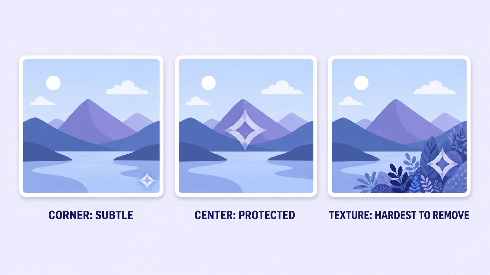
Corner placement
Least distracting, and the standard for portfolios and social. The weakness is obvious: a corner crops off in seconds. Mitigate it by insetting the mark further from the edge than feels natural, so cropping it out also removes a noticeable chunk of the composition.
Centered placement
Hardest to remove without visibly damaging the image, and therefore correct for proofs, previews, and anything shared before payment. The cost is that it dominates the photo, which is fine when that’s the point.
The textured-area trick
Worth knowing because almost nobody does it: place the mark over a detailed, textured region (foliage, fabric, gravel) rather than over flat sky or a plain wall. Clone and inpaint tools reconstruct flat areas almost perfectly and struggle with irregular detail, so the same mark becomes meaningfully harder to erase at no cost to how it looks.
Designing a mark that survives being small
Your watermark will be viewed at thumbnail size more often than at full size, which rules out most of what people design.
- Light on dark, dark on light. A white mark disappears into a bright sky; a black one vanishes in shadows. If you shoot varied scenes, keep both versions and pick per image.
- Add a soft shadow or thin outline. One or two pixels of contrast edge keeps the mark legible across both light and dark regions, which solves the mixed-tone problem without needing two files.
- Text beats logo for most people. A clean handle or domain in a simple typeface stays readable at 200 pixels wide. Detailed logos turn to mush, and a mark nobody can read attributes nothing.
- Keep it to about 5–10% of the image width. Bigger reads as insecurity; smaller stops functioning as attribution.
- Use a transparent PNG. Your mark file needs an alpha channel so it composites onto any photo. If it currently sits on a white box, that’s the format problem we covered here.
How to watermark your photos, step by step
- Prepare the mark once. Make a transparent PNG of your text or logo, generously sized (around 1000 px wide) so it scales down cleanly for any photo.
- Open your photo in the editor. Work on a copy, always. The unmarked master stays archived.
- Place the mark as a layer and scale it to roughly 5–10% of the image width.
- Set opacity by use case using the table above: around 30% for public work, higher for proofs.
- Position deliberately. Inset from the corner, or centered over texture, depending on whether politeness or protection wins for this image.
- Export, then check at thumbnail size. Shrink the result to about 300 px wide. If the mark is illegible, it’s decoration rather than attribution; if it’s the first thing you see, it’s too heavy.
Two practical notes. Resize before watermarking, not after, so the mark doesn’t get scaled to an awkward size or softened by resampling. And if the image is headed for a website, compress it after the mark is applied, since compression treats fine outlines roughly.
Add your mark in the browser, free
Text, layers, and opacity control. No install, no watermark of ours on your work.
Open the ArtsFlick Photo EditorWhen not to watermark
Marking everything by reflex costs you more than it protects.
- Product listings. Amazon bans text and watermarks on main images outright, and other marketplaces discourage them. See our listing requirements guide for what’s actually allowed.
- Delivered client work. They paid for clean files. A mark on final delivery reads as distrust.
- Images meant to spread. Memes, free resources, and community content travel further unmarked, and reach is sometimes worth more than credit.
- Anything you’d be embarrassed to have cropped. If the mark ruins the composition, you’ve either designed it wrong or chosen the wrong image to protect.
One alternative worth knowing for work you genuinely need to trace: embedded metadata and content credentials record authorship inside the file without touching a single visible pixel. The C2PA standard is the version gaining real adoption, and major camera makers and editing tools are building support for it. Less deterrent, better provenance, and increasingly the direction the industry is heading.
Which raises a fair question about where all this is going. As provenance data becomes standard and platforms start surfacing it, the case for visible marks narrows toward the things metadata can’t do: deterring the casual reposter who will never inspect a file, and putting your name in front of people who see the image without ever visiting your site. Those two jobs aren’t going away, so watermarks aren’t either. But the reflex to mark every single file is worth retiring in favour of asking, per image, which job you actually need done.