Free Photo Effects Online
Lift a dark photo with Gamma, bring back faded colour with Vibrance, turn a picture black and white, invert it into a negative or sharpen the detail. ArtsFlick has 14 photo effects that run in your browser, and each one changes a single property of the image, so you stay in control of the result. Free, no sign-up, and no ArtsFlick watermark on the download.

Drag or click to upload images to start editing.

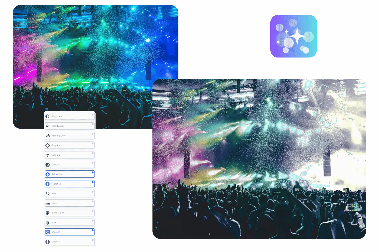
How to Apply Photo Effects Online
1. Upload your photo
Drop a JPEG, PNG or WebP image into the upload box at the top of this page, or upload it directly in the online photo editor. No sign-up is required.
2. Select your photo
Click the photo on the canvas so the effects apply to it.
3. Open the Effects panel
Open Effects from the editor's side menu. Effects and Filters share the same menu under separate headings, so check that you are in Effects.
4. Apply and adjust an effect
Pick an effect from the list and adjust it where it has a setting. Effects stack, so you can add a second or third one on top.
5. Download your photo
Save the result as PNG or JPEG. The download is free and carries no ArtsFlick watermark.
All 14 Photo Effects, Grouped by What They Do
Light and Contrast: Brightness, Gamma, Contrast
These three decide how light or dark the photo looks, and they behave differently. Brightness moves every pixel by the same amount, which is quick but flattens the image if you push it far. Gamma works mainly on the midtones, so it can open up a dark photo without turning the bright sky white. Contrast widens or narrows the gap between the light and dark areas. For most underexposed photos, Gamma first and a small Contrast boost after gives a cleaner result than Brightness alone.
Colour Strength and Tone: Saturation, Vibrance, Hue, Blend Color
Saturation and Vibrance both make colours stronger. Saturation raises every colour by the same proportion, while Vibrance favours the muted ones, which makes it the safer choice for portraits. Hue rotates every colour in the photo around the colour wheel at once. Blend Color mixes a colour you choose into the whole image, which is a quick way to give a set of photos the same tint.
Colour Conversion: Grayscale, Invert, ColorMatrix, Remove Color
These replace the photo's colours rather than adjusting them. Grayscale turns it black and white. Invert flips every colour to its opposite, like a film negative. ColorMatrix remixes the red, green and blue channels into one another for a shifted colour balance. Remove Color clears pixels close to a colour you pick, which works on plain backgrounds. JPEG cannot store transparency, so download as PNG if you want the cleared area to stay transparent. Our comparison of PNG, JPG and WebP explains the difference.
Detail and Texture: Sharpen, Emboss, Noise
Sharpen increases contrast along edges so detail reads more crisply. Emboss turns the photo into a grey relief, as if it were pressed into metal or paper. Noise adds random grain, which can give a clean digital photo a film-like texture or hide banding in smooth skies. Apply these last: sharpening before a colour change can exaggerate edges that the colour change then makes more visible.
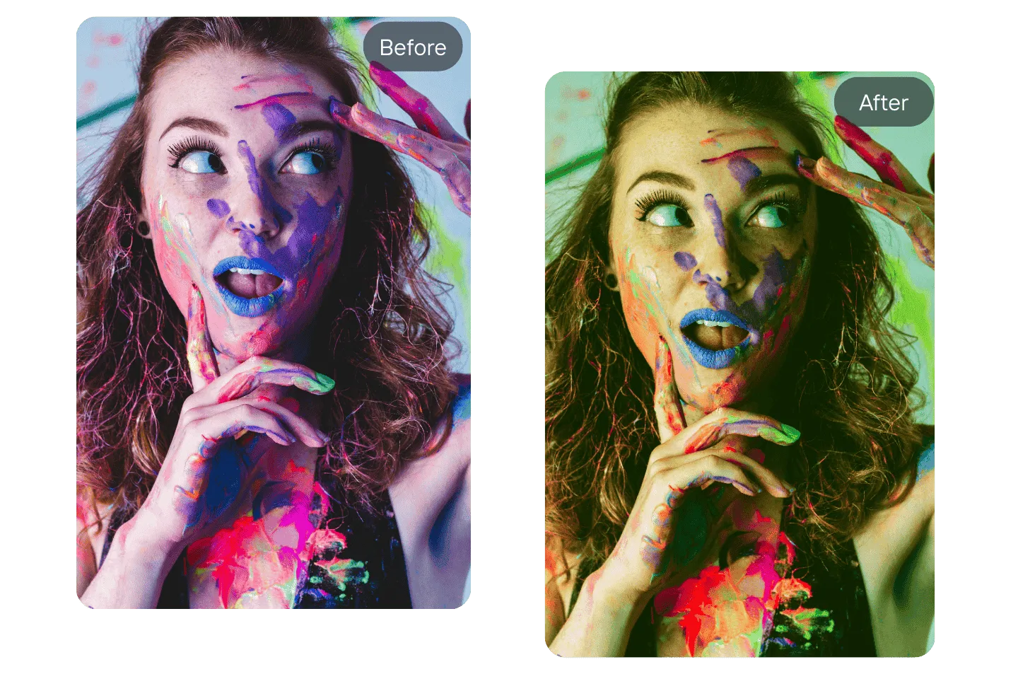
Gamma: Brighten a Dark Photo Without Washing It Out
A photo taken indoors or against a bright window often has the subject in shadow. The obvious fix is Brightness, but Brightness lifts everything equally: the shadows come up, and so does the window, which turns flat white and loses its detail.
Gamma is the better tool for this. It changes the midtones most and leaves pure black and pure white where they are, so faces and shadow detail lighten while the brightest parts of the photo hold. If the result looks a little flat afterwards, add a small amount of Contrast to restore depth. The underlying technique, gamma correction, is the same curve monitors and cameras use to map brightness.
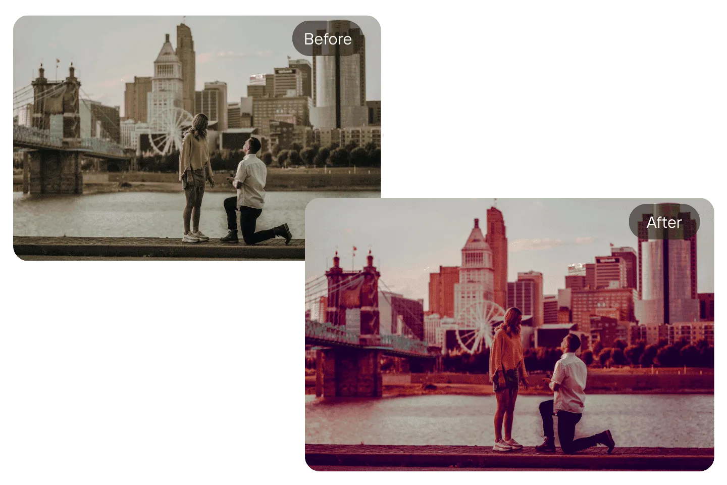
ColorMatrix: Remix the Colour Channels
Every pixel in a photo is a mix of red, green and blue. Most colour effects scale those three values up or down. ColorMatrix goes further and mixes them into each other, so some of the red can feed the green, some of the blue can feed the red, and so on.
The result is a change in colour balance that no single slider produces, the kind of shift used to build film-style looks. It is a strong effect, so check skin tones and skies after applying it, since those are where an unnatural colour shows first.
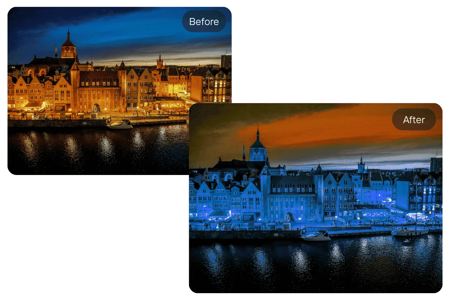
Hue: Shift Every Colour Around the Wheel
Hue rotates all the colours in the photo by the same angle on the colour wheel. Reds move toward orange or magenta, blues toward cyan or purple, and every other colour shifts with them, so the relationships between colours stay intact.
Small shifts change the mood of a landscape or a graphic. Large shifts produce surreal colour, which works for posters and abstract images. People are the exception: skin tones look wrong after even a modest hue shift, so for portraits, use Blend Color or Vibrance instead.
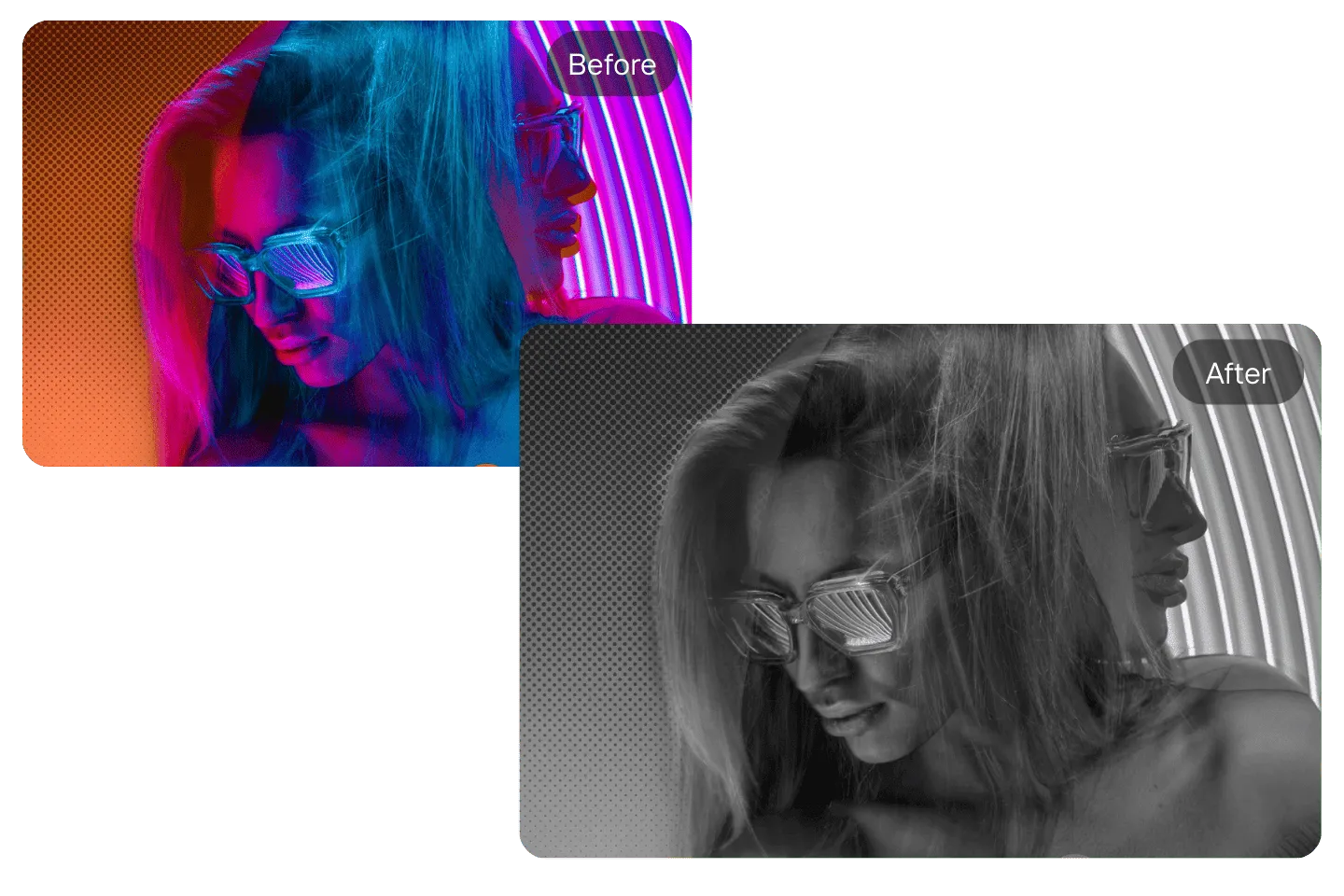
Grayscale: Turn a Photo Black and White
Grayscale removes colour and keeps only brightness, which puts the attention on shape, texture and light. It suits portraits, architecture and photos where the colours clash or distract from the subject.
A straight conversion often looks flat, because two colours that were easy to tell apart, such as a red shirt against green leaves, can turn into almost the same grey. Adding Contrast after Grayscale separates the tones again and gives the photo the depth people expect from black and white.
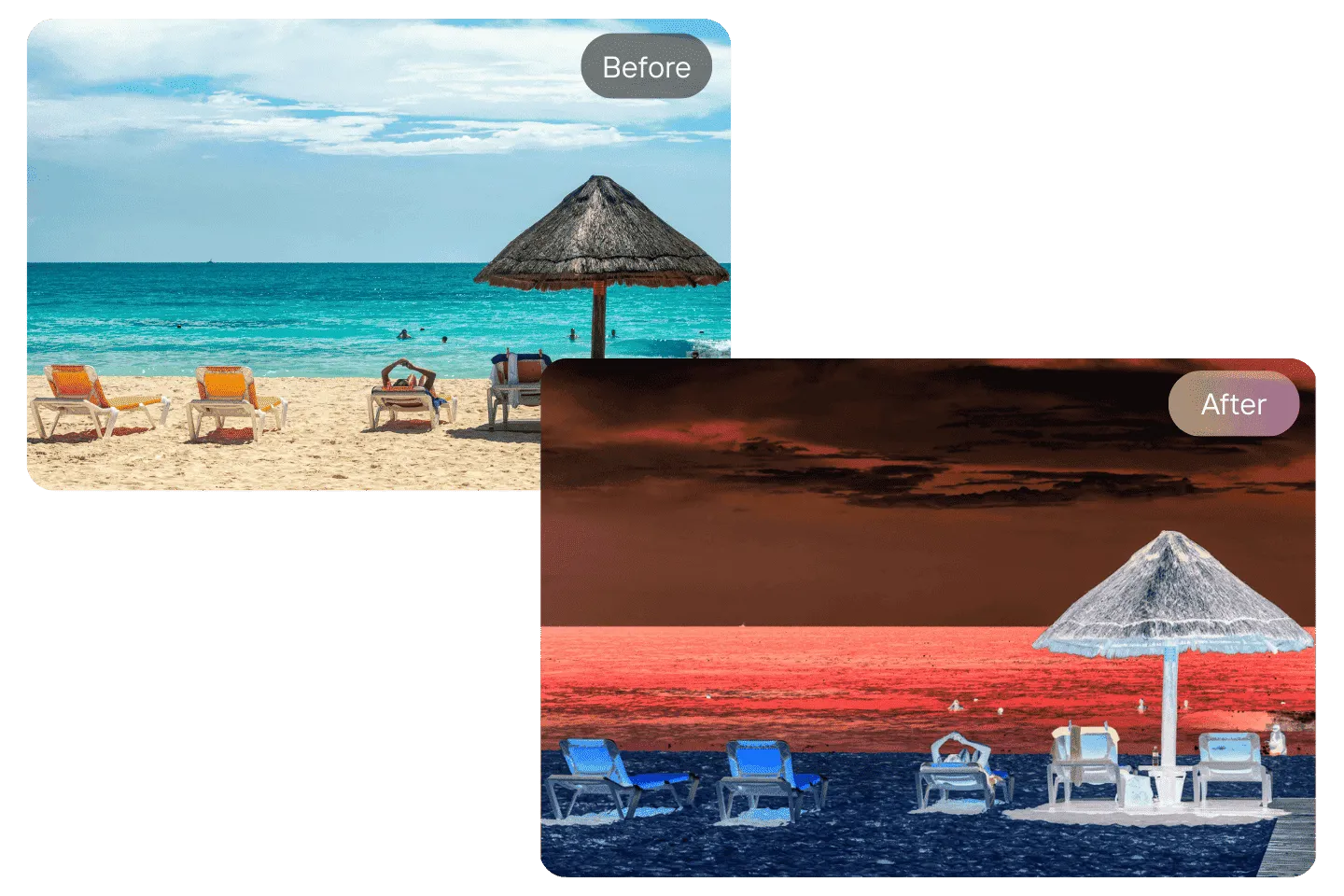
Invert: Make a Colour Negative
Invert flips every colour to its opposite. Black becomes white, blue becomes orange, green becomes magenta. The result is a negative, which is useful for graphic, poster-like images and for making a light diagram or screenshot readable on a dark background.
It also works in reverse. Invert a scan of a black and white film negative and you get the positive photo back. Colour negatives need more work, because the film's orange base turns blue when inverted, so expect to correct the colour afterwards.

Emboss and Sharpen: Working With Edges
Emboss and Sharpen both work on the edges in a photo, with very different results. Emboss turns edges into highlights and shadows on a grey surface, so the picture looks stamped into metal or paper. Bold subjects with clear outlines, such as text, logos or buildings, emboss well; busy scenes turn into texture.
Sharpen increases contrast along edges so detail looks crisper. Too much leaves bright halos around outlines, and those are easy to miss on a phone screen. Apply Sharpen as the last effect, then zoom in to check the edges before you download.

Apply Photo Effects Online in a Mobile Browser
The editor runs in the browser on a phone or tablet, with no app to install. Upload from your camera roll, apply effects, and download the result straight back to your device.
A small screen hides some problems. Grain from Noise, halos from Sharpen and colour shifts in skin tones all look milder on a phone than they will on a laptop or a printed page. Zoom in on the photo before you download, especially if it is going anywhere other than a phone.
Effects or Filters? Use Both, in That Order
Effects and Filters sit in the same menu in the editor, but they do different jobs. An effect changes one thing, such as brightness, gamma or hue, and lets you decide how much. A filter applies a whole preset look in one click. Effects are for correcting a photo; photo filters are for styling it.
The order matters. Fix exposure and colour with effects first, then add a filter on top. A filter applied to a dark or washed-out photo carries those problems into the final look, and a filter applied to a corrected photo looks the way its preview promised. Once the photo looks right, you can crop it or add text on the same canvas.