How to Make Text Readable on a Photo (Any Background)

You can make text readable on a photo in under a minute, as long as you know which problem you’re fixing. And it’s rarely the font. It’s white letters over a pale sky, a headline parked on the busiest part of the picture, or a caption that looked fine on a laptop and turned into specks on a phone.
Below are the seven fixes I reach for, in the order I try them. You’ll also get two things most guides skip: the contrast numbers that tell you when a fix is actually needed, and the simple math for how big text must be to survive a phone screen.
Why text disappears on photos
Readability comes down to contrast: how different the brightness of the letters is from the brightness right behind them. The web accessibility standard, WCAG’s contrast guideline from the W3C, puts numbers on it. Normal text needs a contrast ratio of at least 4.5:1. Large text (roughly 24px, or about 18.5px if bold) needs 3:1. The scale runs from 1:1, which is invisible, to 21:1, which is black on white.
Now put that against a real photo. White text on a pale sky blue scores about 1.7:1. Black text on the same sky scores about 12:1. Same photo, same spot, completely different result.
The harder case is the middle. On a mid grey like concrete or an overcast street, white text reaches about 4.5:1 and black reaches about 4.6:1. Whichever you pick, you barely scrape past the line. That’s the mid-tone trap, and it’s why changing the colour sometimes does nothing. On mid-tones you need to change the background behind the letters, not the letters.
There’s a second problem the numbers don’t show: texture. Contrast is measured against a flat colour, but leaves, crowds and gravel break up the edges of each letter. Text can have decent average contrast and still be hard to read over a busy area.
7 fixes, from lightest touch to heaviest
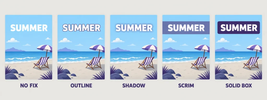
Start at the top and stop at the first fix that works. Stacking all of them at once (outline, shadow and a box) makes text look heavy and amateur.
1. Move the text to a quiet area
Before touching any setting, look for copy space: sky, a plain wall, an out-of-focus background, a tabletop. Text placed there often needs nothing else. If the photo has no calm area, try cropping wider or shifting the subject to one side so a calm area appears. If you shoot your own photos, leave that space on purpose.
2. Flip the colour to match the area
Light text on dark areas, dark text on light ones. Instead of pure black or white, try a colour from the photo itself: a deep navy taken from the shadows or a warm cream from the highlights looks more designed and usually keeps enough contrast. This fix only works when the area behind the text is mostly one brightness.
3. Add a thin outline
An outline gives every letter its own edge, so the background matters much less. The W3C guideline even notes that a narrow border around a letter counts as part of the letter when you measure contrast. White text with a thin dark outline reads on light and dark areas alike.
Keep it thin: about a fifteenth to a twentieth of the text size, so 3 to 4px on 60px text. Go much thicker and you get the classic meme look, which is great for memes and odd everywhere else.
4. Add a soft shadow
A soft shadow darkens just the area around each letter without drawing an obvious line. As a starting point, use a dark colour, a blur of 6 to 12px and a small offset of 2 or 3px downward. A soft shadow beats a hard one; a hard, offset shadow makes letters look doubled. Shadows help most on mid-tones and do little on very bright, busy areas.
5. Darken the photo behind the text
When the background is busy, calm it down. Either lower the brightness of the whole photo slightly, or place a dark rectangle at 30 to 50% opacity over the area where the text sits. Designers call this a scrim. In practice, covering only the third of the image that holds the text keeps the rest of the photo bright and natural.
6. Put the text on a solid box
The most reliable fix and the least subtle. Once text sits on a solid shape, the photo no longer matters: contrast is between the text and the box, and you can easily hit 7:1 or more. Use it for anything people must read exactly, like a date, a price, a phone number or a web address.
7. Go bigger and bolder
Large text only needs 3:1 contrast instead of 4.5:1, so size alone can rescue a borderline photo. Weight matters too. The W3C notes that thin fonts can render fainter than their colour suggests, because the edges of each letter get smoothed into the background. A bold weight keeps more solid colour in every stroke.
Which fix to try first for each background
If you don’t want to work through the list, match the background to its usual best fix:
|
What’s behind the text |
Try first |
The contrast is already there |
|
Clear sky, plain wall, studio backdrop |
Flip the colour |
The contrast is already there |
|
Mid-tone grey: concrete, overcast street |
Outline or soft shadow |
Neither black nor white passes comfortably |
|
Busy texture: leaves, crowd, gravel |
Darken behind the text |
Calms the texture, not just the colour |
|
Light and dark under the same line |
Solid box |
The only fix that works on both |
|
Small print: dates, prices, URLs |
Solid box plus bold |
Small text needs the full 4.5:1 |
How big text needs to be on a phone
Most text is designed on a big screen and read on a small one. According to Statcounter’s mobile screen data, the most common phone screens in August 2026 were 414, 360 and 390 points wide. So a 1080px Instagram post shown across a 360-point screen shrinks to a third of its size. A 30px caption on your canvas ends up about 10px tall on the phone, which is smaller than the fine print in most apps.
Here’s the rule I use: canvas size = the size you want on screen × canvas width ÷ 360. Aim for 16 on screen for captions (the default text size in browsers) and 24 for headlines (the point where text counts as large).
|
Canvas width |
Example |
Minimum caption size |
Minimum headline size |
|
1080px |
Instagram post or story |
48px |
72px |
|
1200px |
Link preview or blog image |
54px |
80px |
|
1920px |
16:9 banner or slide seen on a phone |
86px |
128px |
Treat these as minimums, not targets. Lowercase letters are shorter than the font size suggests, and people scroll fast. If you’re working on a specific format, our guide to Instagram post sizes lists the exact canvas for each one, and the YouTube thumbnail guide covers text that has to work at tiny sizes.
Fonts that hold up on busy backgrounds
For anything smaller than a headline, use a bold or semi-bold sans serif. Simple shapes and even strokes survive texture and compression better than anything decorative.
Script and handwriting fonts are lovely at large sizes on a calm area, and close to unreadable at caption size over a busy one. Hairline weights fail for the same reason thin strokes do: there’s not enough solid colour in each letter.
All caps work for short phrases of three or four words, especially with a little extra letter spacing. Beyond that, lowercase reads faster. And keep to two fonts at most: one expressive font for the headline and one plain font for everything else.
The 20% text rule is gone, but less text still wins
Facebook used to limit ads with more than 20% text in the image. In September 2020 it told advertisers it would no longer penalize ads with more image text, though it still says images with less text tend to perform better. Plenty of guides still repeat the old rule.
The practical version: one headline and one supporting line on the image, and the details in the caption. It helps accessibility too, since screen readers can’t read words baked into a picture. Repeat the key message in the alt text or the caption, as our image SEO guide explains.
How to make text readable on a photo in ArtsFlick
Every fix above works in the free browser editor, with no account and no watermark on the download:
- Open the ArtsFlick photo editor and upload your photo.
- If you want a scrim, add it first: open Shapes, add a rectangle, choose a dark fill and lower the transparency slider until the photo shows through. Adding it before the text keeps the text on top.
- Click Text in the left menu, choose Add a text box and type your words.
- Drag the text onto the quiet area and size it using the table above.
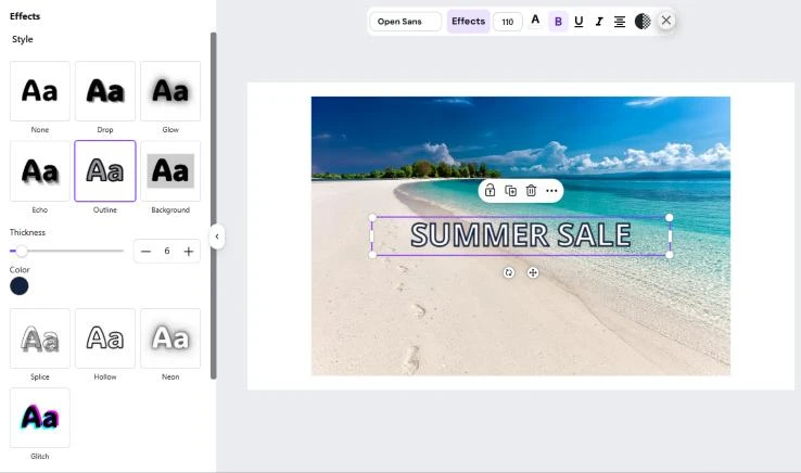
- Pick the colour in the toolbar. Then open Effects and choose Outline for an edge, Drop for an offset shadow or Background for a solid box. The toolbar shadow settings let you adjust colour, blur and the X and Y offset.
- Download as PNG for small, sharp text, or JPEG for a smaller file.
Put readable text on your photo
Outline, shadow and background effects, 100+ fonts, free PNG or JPEG download.
Try the text toolA 30-second check before you export
Before you download, run three quick tests. They catch almost everything.
Zoom out. Shrink the canvas to about a third of its size. That’s roughly how big it appears in a phone feed. If you have to lean in to read the text, it’s too small or too faint.
Remove the colour. Download a test copy, open it on your phone and apply the black and white (mono) filter in your phone’s photo app. Contrast depends on brightness, not hue, so red text on a green field can look bold in colour and vanish in grey. If the text disappears here, it will be hard to read for many people.
Look at it on a phone. Send the image to your phone and view it at normal size, at arm’s length. It takes ten seconds, and it’s the test that matters most, because that’s where most people will see it.