Best Instagram Post Sizes in 2026 (Every Format)
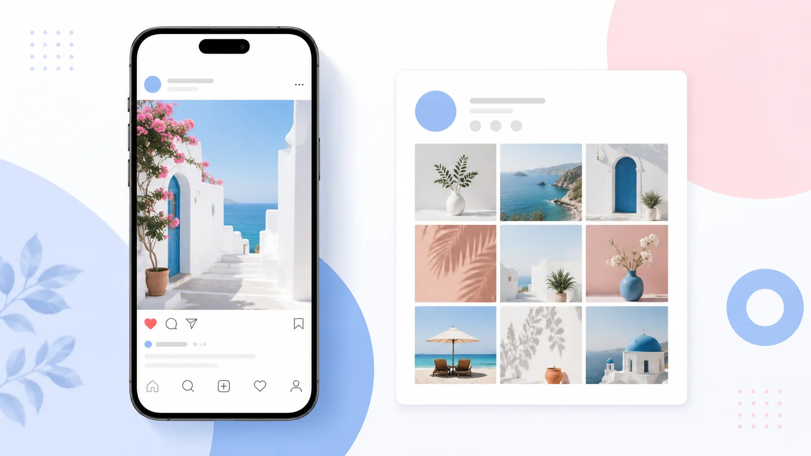
If your Instagram posts look sharp in the feed but get chopped on your profile grid, you’re not imagining it, and it’s not your fault. Instagram changed the rules. Getting the best Instagram post sizes in 2026 now means designing for two shapes at once: the feed and the grid, which no longer match.
This guide gives you every current dimension in pixels, explains the grid change that’s cropping everyone’s photos, and shows the one safe-zone trick that makes a single upload look right in both places. Whether you post daily or twice a month, the numbers below are the ones that actually matter this year.
Quick-reference chart: every Instagram size
Here are the best Instagram post sizes in 2026 in one place. Every dimension is in pixels, at the 1080-wide resolution Instagram expects, so bookmark this table.
|
Format |
Size (px) |
Ratio |
|
Feed, portrait (recommended) |
1080 × 1350 |
4:5 |
|
Feed, grid-safe portrait |
1080 × 1440 |
3:4 |
|
Feed, square |
1080 × 1080 |
1:1 |
|
Feed, landscape |
1080 × 566 |
1.91:1 |
|
Stories & Reels |
1080 × 1920 |
9:16 |
|
Carousel (per slide) |
1080 × 1350 |
4:5 |
|
Profile photo |
320 × 320 |
1:1 |
One rule runs through the whole table: upload at 1080 pixels wide. Go smaller and Instagram upscales it into a blur; go much larger and it recompresses it with settings you don’t control. If a photo isn’t 1080 wide yet, resize it to these exact dimensions before uploading.
The big 2026 change: your grid is now 3:4
Here’s the thing most size guides mention in passing and then move on from, even though it’s the single biggest reason people’s posts look wrong in 2026.
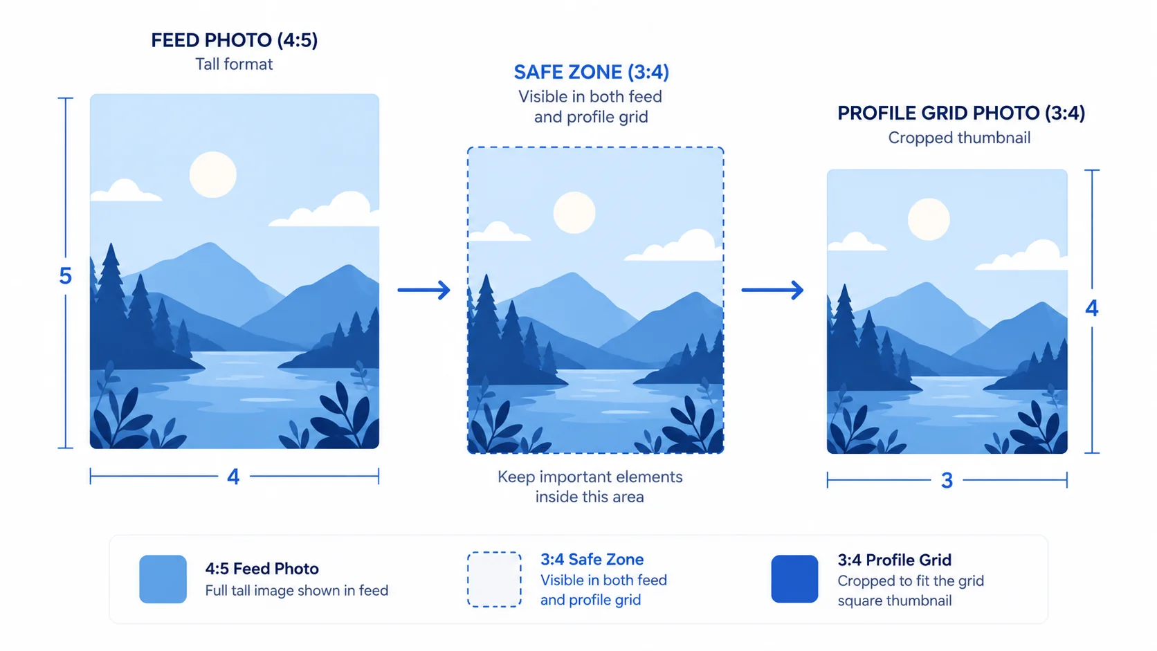
Instagram retired its iconic 1:1 square grid. Profile thumbnails now preview at 3:4 (a taller portrait). The feed still shows your post at whatever ratio you uploaded, up to 4:5, but the grid crops every thumbnail to 3:4. So the standard, recommended 4:5 post looks perfect in the feed and then gets trimmed slightly at the top and bottom on your profile grid.
You have two ways to handle it:
- Design for 4:5 but respect a 3:4 safe zone. Keep faces, text, and logos within the central 3:4 area so the grid crop never cuts anything important. Your feed post gets the taller, attention-grabbing 4:5 shape; your grid stays clean.
- Upload at 3:4 (1080 × 1440). The post shows on the grid with zero crop because it already matches. The trade-off: in the feed it’s slightly shorter than a 4:5 post, so it fills a hair less screen.
Feed posts: portrait, square, landscape
Instagram accepts three feed shapes, and the difference between them is how much of a phone screen they claim.
Portrait, 1080 × 1350 (4:5)
The default you should reach for. At 4:5 it takes up the most vertical space of any feed post, which means more of the screen is yours as someone scrolls. For most brands and creators, this is simply the best Instagram post size to design around.
Square, 1080 × 1080 (1:1)
Still supported and still fine, especially if your visual style is built on squares. It just wins less screen than 4:5, so it works a little less hard for reach.
Landscape, 1080 × 566 (1.91:1)
The smallest footprint of the three. Useful for genuinely wide images, but it’s the weakest choice for feed presence, so use it deliberately rather than by default.
Stories and Reels: 1080 × 1920
Both Stories and Reels are full-screen vertical video and images at 1080 × 1920 (9:16). This fills the entire phone screen with no letterbox bars.
The catch with 9:16 is the interface overlay. Instagram places your username and time at the top and the caption, action buttons, and audio info at the bottom, and those elements sit on top of your content. Design as if roughly the top 14% and bottom 21% of the frame will be partly covered. In practice, keep anything that matters, text especially, at least 250 pixels away from the top and bottom edges.
Resize to any Instagram size, free
Set the exact pixels for feed, Stories, or Reels and export sharp, in your browser.
Try the ArtsFlick Image ResizerCarousels: keep every slide identical
Carousels reward consistency. Size every slide to 1080 × 1350 (4:5) and keep the dimensions identical across the whole set. The first slide sets the aspect ratio for the entire carousel, and Instagram crops every following slide to match it, so one oddly-sized slide throws off all the others.
A welcome 2026 update: you can now reorder and replace carousel slides after publishing, so a wrong-order mistake is no longer permanent. Sizing still isn’t editable after posting, though, so get the dimensions right before you hit share.
Profile photo: 320 × 320
Upload your profile picture at 320 × 320 (1:1). Instagram displays it as a circle everywhere in the app, so keep your face or logo centered and away from the corners, which get clipped by the circular mask. A square upload with the subject centered is all you need.
Safe zones: the detail that saves your posts
Safe zones are the margins you leave empty so nothing important gets cropped or covered. Two matter most in 2026:
- Feed to grid (3:4 safe zone). Even when you upload 4:5, keep faces, text, and logos inside the central 3:4 region. The grid crop then removes only empty margin.
- Stories and Reels (top and bottom). Keep key content about 250 px clear of the top and bottom edges so Instagram’s interface doesn’t sit on it.
Designing to safe zones once, as a habit, is faster than re-cropping posts after you notice a problem, and it’s the difference between a grid that looks intentional and one that looks accidentally trimmed.
Export settings for the sharpest upload
Right size, wrong export, and it still looks soft. A few settings keep quality intact:
- Width: always 1080 px. It’s the resolution Instagram is built around.
- Format: JPG for photos, PNG for graphics with sharp text or flat color. Instagram recompresses either way, so start from a clean, high-quality file.
- Quality: export JPGs at 80 to 85%. Higher is wasted; Instagram will compress it anyway.
- Color: sRGB. Other color profiles can shift once Instagram processes the image.
If you want the reasoning behind those choices, our guide on PNG vs JPG vs WebP covers which format to use when, and resizing without losing quality covers getting to 1080 px cleanly. Instagram’s own Help Center is the source to check if a spec ever changes mid-year.
Mistakes to avoid
Even with the best Instagram post sizes in 2026 in hand, a few habits still trip people up. These are the ones worth breaking:
- Designing edge-to-edge at 4:5. The grid crops to 3:4 and eats your top and bottom. Keep the important part centered.
- Uploading below 1080 px wide. Instagram upscales small images into a blur. Start at 1080 or resize up to it from a larger original.
- Mixed sizes in one carousel. The first slide’s ratio crops the rest. Size every slide the same.
- Putting text at the bottom of a Story. The caption and buttons cover it. Respect the 250 px margin.
- Uploading a giant 4000 px file “for quality”. Instagram recompresses it on its terms. Deliver 1080 wide yourself and keep control.