How to Make a YouTube Thumbnail That Gets Clicked
Want to learn how to make a YouTube thumbnail that people actually click? Then here’s the uncomfortable truth first: viewers decide in a fraction of a second, from an image smaller than a business card, whether your video exists to them. The title helps. The thumbnail decides.
There’s also a very 2026 reason not to trust older guides on this. YouTube quietly rewrote its thumbnail specifications this year, and most articles ranking today still quote rules that no longer apply. Below: the current specs straight from YouTube’s documentation, the five design elements that survive being shrunk, a build process you can repeat, and the platform’s built-in A/B testing that replaces guesswork with your own channel’s data.
The 2026 specs (yes, they changed)
If you’ve read that thumbnails must stay under 2 MB, that advice is outdated. YouTube now recommends full 4K thumbnails, and the size limit depends on where you upload from:
|
Spec |
Current recommendation |
|
Resolution |
3840 × 2160 (4K) recommended; 640 px minimum width; 1280 × 720 still works fine |
|
Aspect ratio |
16:9 (1:1 for podcast playlists) |
|
File size limit |
50 MB uploading from desktop; 2 MB from mobile |
|
Formats |
JPG, PNG, GIF (no WebP) |
|
Account requirement |
Verified account to upload custom thumbnails |
Two details from the fine print that most guides miss. Vertical videos get their custom 16:9 thumbnail replaced by an auto-generated 4:5 crop on the home, explore, and subscriptions feeds, so if you post vertical, keep the subject centered. And Shorts can’t have custom thumbnails at all: you pick a frame from the video at upload, and it’s locked afterward. The full documentation lives on YouTube’s thumbnail help page.
Does 4K actually matter? On phones, barely. On televisions, increasingly so. Living-room viewing keeps growing, and a 1280 px thumbnail stretched across a 55-inch screen sits noticeably soft next to a 4K one. Design large if your tools allow it; a sharp 1280 × 720 remains perfectly acceptable.
Anatomy of a clickable thumbnail
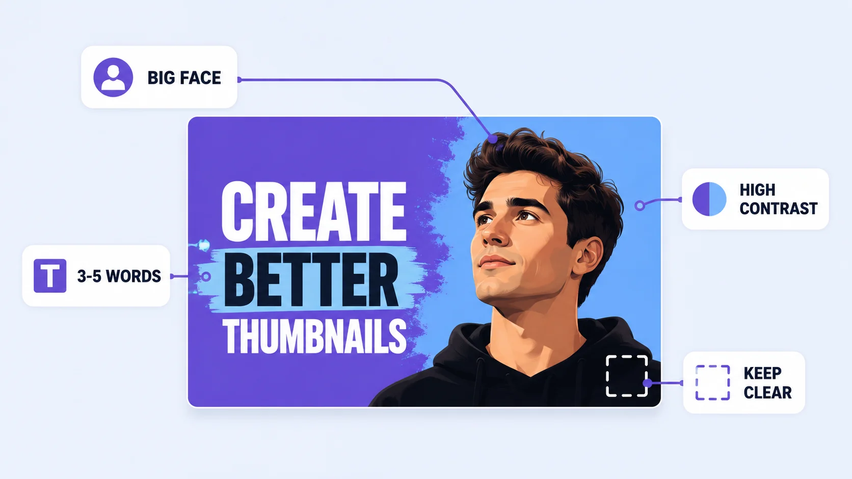
Study any channel that grew fast and the same five elements repeat. None of them are decoration. Each exists because it survives being shrunk to postage-stamp size in a crowded feed.
A face with a readable emotion
Human faces pull attention, and exaggerated expressions (surprise, delight, skepticism) consistently outperform neutral ones in creator A/B tests. If your content has a person, make the face large, well-lit, and emotionally legible. No face? Give the main object the same treatment: big, centered, dramatic.
Three to five words of text, maximum
Thumbnail text is a headline, not a caption. It should add tension the title doesn’t (“I was wrong”, “£40 vs £4,000”, “day 30”), never repeat the title, and stay under six words. Thick, bold sans-serif fonts with strong outlines survive shrinking; thin or script fonts dissolve into noise.
High contrast, few colors
Two or three bold colors beat a rainbow. Contrast against the platform matters too: the app is white or near-black depending on the viewer’s setting, so saturated colors with dark outlines pop in both modes. A subtle color grade that looks refined at full size simply vanishes in a feed.
One focal point
The viewer gives you a fraction of a second. One subject, one idea, generous negative space. If your eye bounces between three competing elements, the design has failed the glance test and the scroll continues.
Consistency across your channel
Recurring fonts, a signature color, a repeatable layout: these make your videos recognizable in a subscriber’s feed before a single word is read. It compounds with every upload, which is why established channels look like a set rather than a pile of one-offs.
How to make a YouTube thumbnail: 6 steps
- Start from a deliberate photo, not a video frame. Shoot ten seconds of stills after recording: exaggerated expressions, clean background, good light. A planned photo beats a frame grab every time.
- Open a 16:9 canvas. In the ArtsFlick photo editor, set the canvas to 3840 × 2160 (or 1280 × 720 minimum) so you design at the real shape from the start.
- Place the subject large and off-center. Fill 40 to 60% of the frame with your face or object, weighted to one side, leaving clean space for text on the other.
- Add your three to five words. Bold font, strong outline or shadow, positioned in the clear space, away from the bottom-right corner where the duration stamp lives.
- Push contrast harder than feels tasteful. Brighten the subject, darken or blur the background, outline the cutout if it helps separation. Thumbnails are posters, not photographs.
- Export as PNG or high-quality JPG. Not WebP, which YouTube rejects for thumbnails. If you need the exact export size, our resizing guide covers getting there cleanly.
Design your thumbnail in the browser, free
Canvas, text, layers, and filters. No install, no watermark on your work.
Try the ArtsFlick Photo EditorThe squint test and safe zones
Most thumbnail failures are catchable in ten seconds, before publishing, with two mechanical checks.
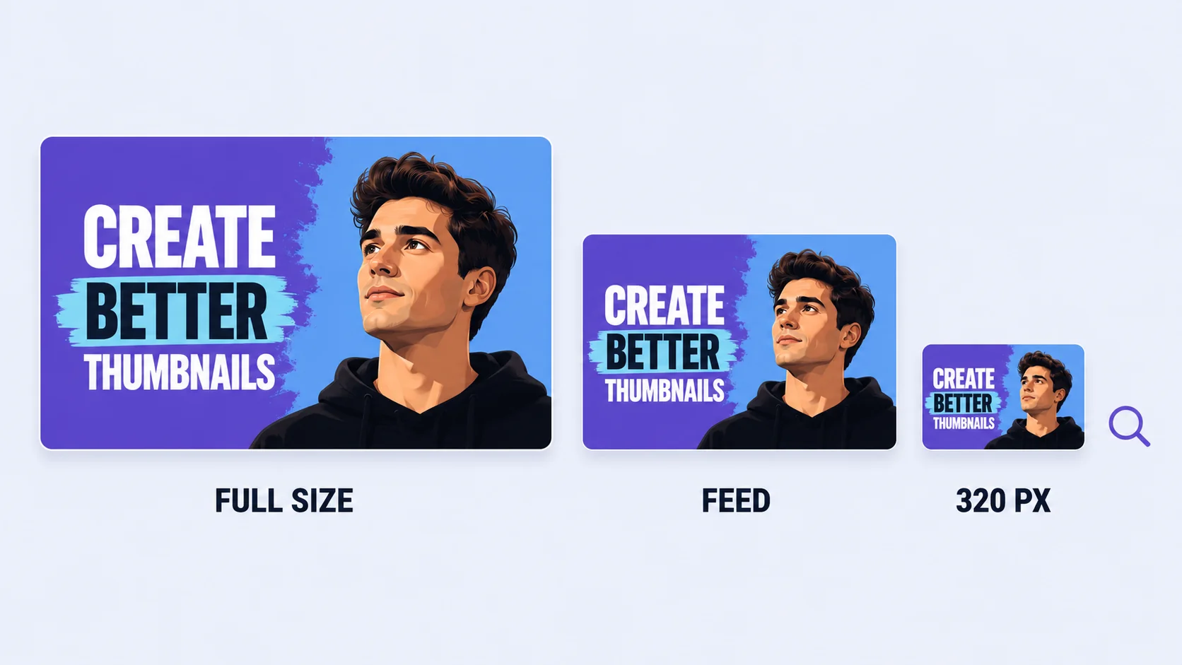
The squint test: shrink your design to feed size, or literally squint at it from arm’s length. Can you still read the emotion and the text? Most thumbnails are first seen at roughly 320 pixels wide on a phone. A design that only works at full size doesn’t work.
The corner rule: the video duration overlays the bottom-right corner of every thumbnail, every time. Text, logos, or faces placed there get covered. Keep that corner visually unimportant.
Stop guessing: A/B test with Test & Compare
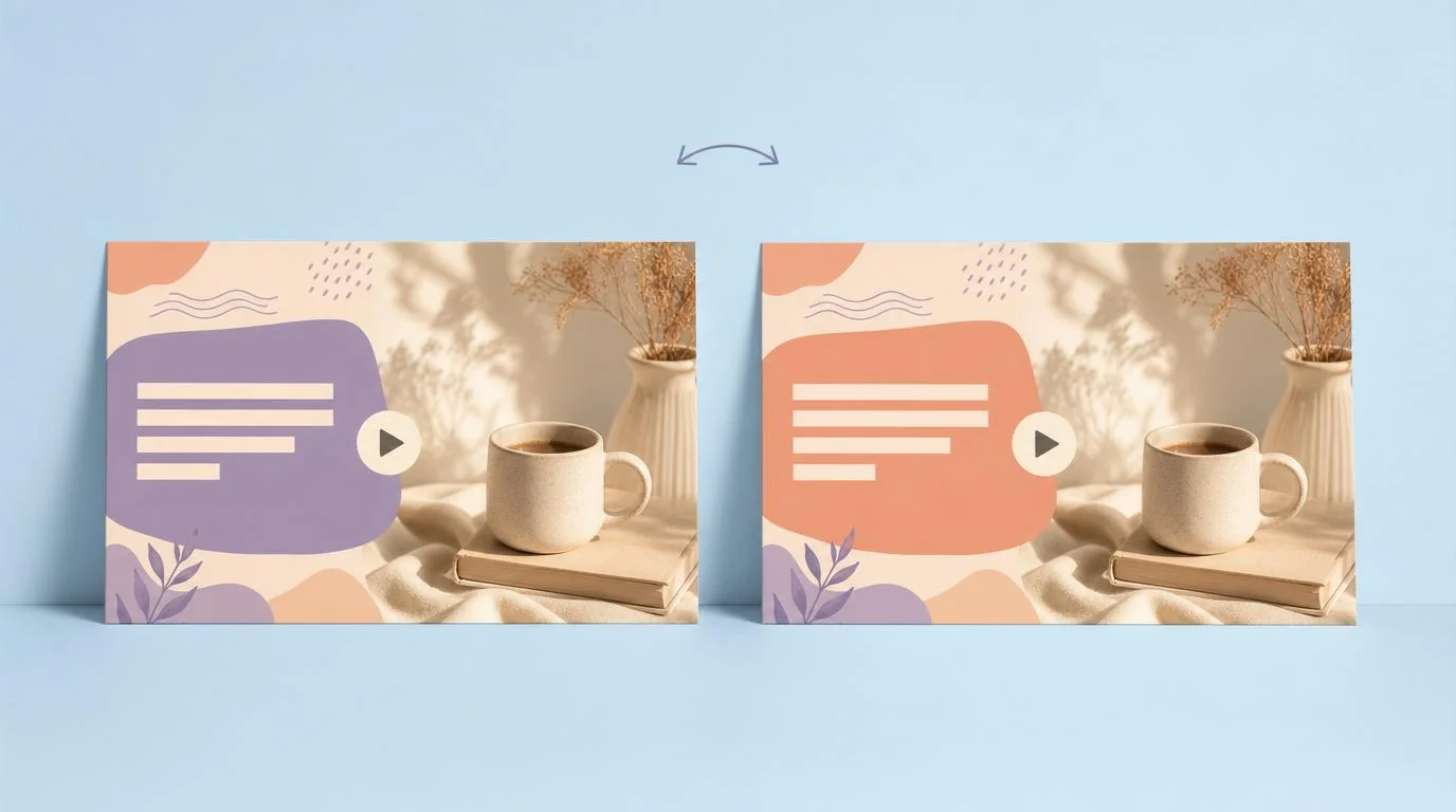
YouTube Studio now has native A/B testing built in, called Test & Compare. Upload up to three thumbnail variants for a video and YouTube splits impressions between them, then promotes the winner based on watch-time share rather than raw clicks, which quietly filters out clickbait that viewers abandon.
Two practices make tests informative rather than noise. Change one variable at a time: different text on the same image, or a different expression with the same text. If everything changes at once, a winning variant teaches you nothing. And give tests enough impressions before judging; smaller channels may need a couple of weeks per test, which is fine. Creator-tool studies consistently show that channels testing regularly lift click-through rates by meaningful double-digit percentages, compounding with every video.
A practical rhythm: design your best thumbnail plus one deliberate variation, publish both through Test & Compare, and fold whatever wins into the next video’s design. Ten videos later you’re working from your channel’s own data instead of borrowed rules.
Should you let AI draft your thumbnail?
Worth knowing in 2026: YouTube Studio itself now offers AI thumbnail generation through Ask Studio. Type a prompt like “create a thumbnail” (or reference a specific video with @), and it analyzes the video’s transcript and themes to suggest tailored options, which you can refine with follow-up prompts like “make the text larger”.
Treat it the way successful channels treat every AI draft: a starting point, not a final answer. Ask Studio doesn’t know your channel’s fonts, your signature colors, or what your last three thumbnails looked like, and consistency is one of the five elements that actually drive clicks. The workflow that gets the best of both: generate a concept there, then rebuild it properly in your editor with your own face shot, brand colors, and text treatment. And whatever produced the image, it still has to pass the squint test and the checklist below; the algorithm judges results, not authorship.
The pre-publish checklist
Thirty seconds before you upload, run the design past these seven checks:
- Readable at 320 px wide (the squint test passed)
- One focal point, not three
- Text is five words or fewer and doesn’t repeat the title
- Bottom-right corner is visually unimportant (duration stamp territory)
- Exported as PNG or JPG, not WebP
- Honest: the thumbnail promises what the video delivers (watch-time-based testing punishes bait anyway)
- Consistent with your channel’s fonts and colors