The Anti-AI Aesthetic: Why Imperfect Images Are Winning

The anti-AI aesthetic went from niche preference to measurable behavior this year. Searches for film grain have climbed 31%, motion blur is up 15% in a single month, and the major visual trend reports for 2026 (Getty, Adobe, Pinterest) all independently flag the same thing: audiences are turning away from flawless images.
That’s a strange sentence to write during the most capable era of image technology ever built. But the logic holds once you say it out loud: when any tool can produce a perfectly lit, perfectly sharp, perfectly composed image in four seconds, perfection stops being evidence of effort. It becomes the default, and defaults are invisible.
What’s actually happening
Three separate 2026 trend reports point the same direction. Getty Images describes authenticity shifting from a surface style to a signal of truth, with audiences drawn to visuals that feel specific and lived-in rather than broadly relatable. Adobe’s creative trends forecast pairs innovation with authenticity as the year’s defining tension. Pinterest’s predictions land in the same place from the culture side, with “intentional imperfection” running through everything from photography to makeup.
The search data backs the reports rather than contradicting them, which is rarer than you’d think. Film grain up 31%, motion blur up 15% in a month, dust overlays and light leaks moving from novelty filters to standard finishing steps. People aren’t just admiring the look; they’re actively hunting for the tools to make it.
The five signals of the anti-AI aesthetic
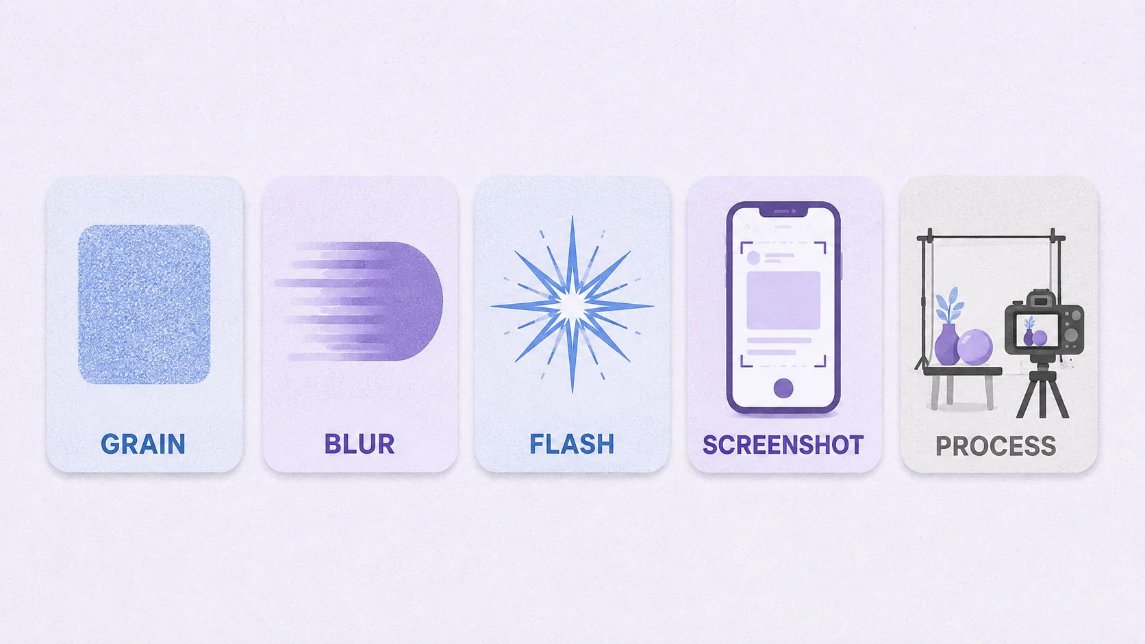
The trend expresses itself through a consistent visual vocabulary. Each element does the same job: prove a human was there.
1. Grain and texture
The clearest marker, and the one with the search data behind it. Grain says the image was captured by something physical rather than computed by something perfect. It’s also why the analog revival and this trend are the same story told twice.
2. Intentional blur
Motion blur, slight focus misses, hand-held shake. AI output is uniformly, unnaturally sharp; a blurred hand or a streaked passing car is difficult to fake convincingly and instantly reads as a real moment.
3. Flash-on snapshots
Direct flash with harsh shadows and blown highlights, the aesthetic of a disposable camera at a party. Technically “bad” lighting, which is precisely the point: nobody generates images that look accidentally lit.
4. Screenshot authenticity
Creators deliberately keeping interface elements in frame: timestamps, chat bubbles, platform UI, the little status bar at the top. Screenshots have become a visual language of their own, signaling speed and unedited reality. A cropped, cleaned-up screenshot loses the effect entirely, which tells you the interface clutter is doing the work, not the content inside it.
5. Visible process
Behind-the-scenes frames, unflattering angles, the shot before the good shot. Brands increasingly publish the making-of rather than only the polished result, because the making-of is harder to fabricate.
Why now, and why it won’t reverse quickly
Scarcity decides value in aesthetics, the same way it does anywhere else. For a century, sharp and well-lit was expensive: it needed equipment, skill, and time, so it signaled seriousness. Then it got cheap, first through better cameras, then through automatic correction, and finally through generation. In 2026 a polished image costs nothing to produce and therefore proves nothing about who made it.
Imperfection is now the expensive signal, because it implies presence. Someone was in the room. Something happened once, unrepeatably, and this frame is the evidence. That’s not nostalgia, though nostalgia rides along with it; it’s a rational response to a market where polish became free.
How to use the anti-AI aesthetic without faking it
The honest version starts with real photos. Every technique below is a finishing step on something you actually shot, not a costume worn by a generated image.
- Shoot more, curate less. The candid frame between the posed ones is usually the one that works now. Keep the shot where someone is mid-laugh and slightly out of focus.
- Add grain last. Fine and even for a subtle analog feel, coarser for a lo-fi snapshot look. Our guide to making photos look like film covers the full four-step technique, and grain always goes on at the end.
- Lift the blacks slightly. Pure black is a digital tell. A softly faded shadow reads as film, and it takes one slider in the editor.
- Stop straightening everything. A slightly tilted horizon or an off-center subject signals hand-held. Perfect symmetry is an AI fingerprint.
- Leave the imperfection you’d normally fix. The reflection in the window, the cable in the corner, the crumb on the table. Those details are what Getty means by “specific and lived-in.”
Where this backfires: heavy filters applied to obviously generated images. Grain on a plastic-skinned AI portrait doesn’t read as authentic, it reads as an attempt, and audiences are getting fast at spotting it. If you’re working with generated imagery, our guide on fixing AI artifacts is the more useful starting point.
Add grain, fade, and texture in your browser
Film filters and manual tone controls. Free, no install, no watermark.
Try the ArtsFlick Photo EditorAudit your own images this week
A short, concrete exercise. Open your last ten published images and ask:
- Could any of these have been generated? If yes for most of them, you’re relying on a signal that no longer differentiates you.
- Is there a single specific detail in each? A real location, a real person’s hands, a recognizable object from your actual workspace. Generic beats nothing; specific beats generic.
- Do they all look identical in treatment? Uniform polish across a feed is itself a machine signal. Variation reads as human.
- Is anything visibly unretouched? One honest frame in a set lends credibility to the rest.
The obvious risk
Trends become cliché in the direction they were invented against. Grain-heavy, light-leaked, deliberately blurry content is already abundant enough that presets ship with it by default, and a filter applied by millions stops proving anything. Give it a year and “authentic” will be as automated as “polished” is now.
The durable version of this isn’t the aesthetic, it’s the underlying rule: show what only you could show. A specific place, a real process, a person your audience recognizes. Grain is a shortcut to that feeling; actual specificity is the thing itself, and it doesn’t expire when the filter does.
Worth noting the second-order effect too. As imperfection becomes the trusted signal, provenance tooling is quietly filling the gap on the other side, with content credentials embedded in files to verify what was captured versus generated. The aesthetics and the plumbing are converging on the same question, and we covered the practical side of that in our look at generators versus editors.