How to Write AI Image Prompts That Actually Work
Most AI image prompts fail for one reason, and it isn’t a lack of magic words. They leave too many decisions to the model. “A beautiful photo of a woman in a city” contains almost no information: which woman, which city, what time of day, shot how, feeling like what. The model has to invent all of it, and it will invent something different every time you ask.
The fix is a change of posture rather than vocabulary. Stop writing descriptions and start writing the brief you’d hand a photographer. Everything below follows from that one shift.
Write a brief, not a wish
A photographer given “take a beautiful photo of a woman in a city” would immediately ask you five questions. Who is she and what is she doing? Where exactly? What time of day? Shot from where, on what lens? What should it feel like?
Those questions are the prompt. Answer them and you’ve written something the model can execute rather than guess at:
Thirty-four words, and every one removes a decision from the model. That’s the whole craft, and it’s why “prompt engineering” is a grander name than the skill deserves. It’s just briefing.
The five-part structure behind AI image prompts that work
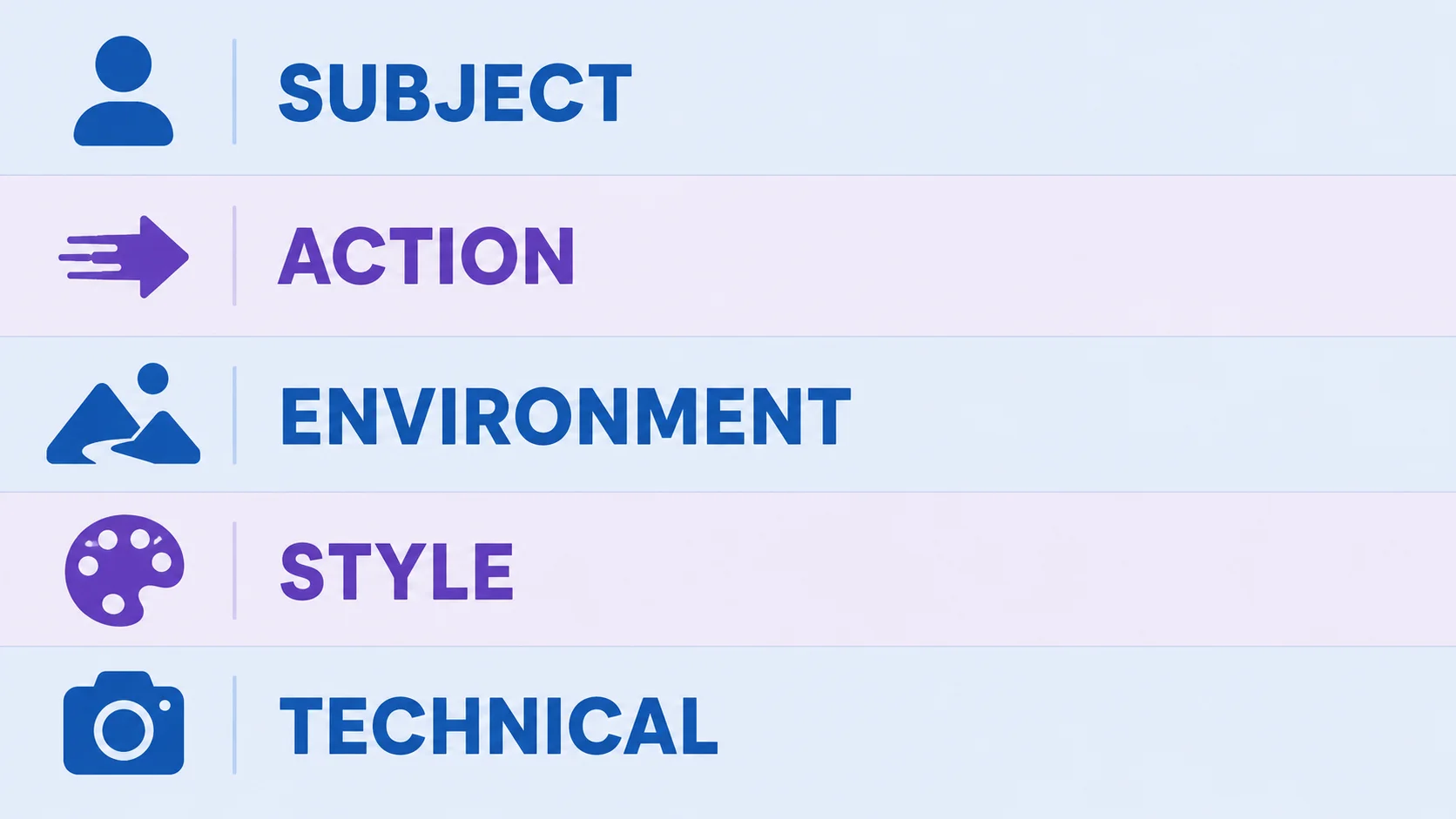
Effective prompts across every current model tend to carry the same five components in a stable order:
|
Part |
What it answers |
Example |
|
Subject |
Who or what, specifically |
a woman in her thirties in a grey wool coat |
|
Action |
What’s happening |
waiting at a crossing |
|
Environment |
Where, and in what conditions |
rain-slicked street in central Tokyo, blue hour |
|
Style |
The visual language |
cinematic, muted colour, film grain |
|
Technical |
Camera, lighting, framing, ratio |
35mm, shallow depth of field, 16:9 |
Order matters less than presence. Miss one and the model fills the gap with its defaults, which is exactly where unwanted results come from. If your outputs keep landing wrong in the same way, the missing part is almost always environment or technical.
Why a 20-word prompt beats a 100-word one
There’s a temptation to keep adding adjectives, and it backfires. Testing consistently finds a well-structured prompt of roughly 15 to 50 words outperforming rambling hundred-word descriptions, because every extra word competes for the model’s attention and dilutes the words that matter.
The words that pull hardest are concrete nouns and specific conditions. The ones that do almost nothing are subjective quality adjectives:
- Beautiful, stunning, amazing, masterpiece: these describe your reaction, not the image. Models can’t act on them.
- Detailed, high quality, 4K, HD: largely folklore carried over from older models. Current systems don’t need to be asked for quality.
- Trending on ArtStation, award-winning: the fossilised remains of 2022 prompt culture. Harmless, useless.
Replace each of those with something concrete. Instead of “high quality lighting”, write “lit by a single window from the left”. Instead of “beautiful colours”, write “muted teal and rust”. The rule: if a word doesn’t change what a camera would have recorded, cut it.
Four worked examples
Each of these fixes a different common failure. Read the reasoning rather than copying the words, because the reasoning transfers to your subject and the words don’t.
A product shot that doesn’t look generated
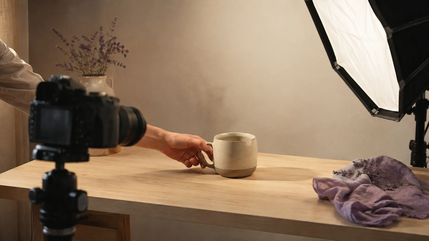
The work is being done by the light. Naming a direction (“from the left”) and its consequence (“shadow to the right”) gives the model a single coherent lighting story, which is what stops the physically impossible lighting that makes generated product shots feel wrong. “Unstyled” is doing something too: it suppresses the props and confetti that models add when left to decorate.
A blog header for an abstract topic
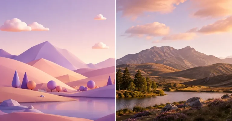
Abstract topics have no obvious subject, so the trick is choosing a concrete scene that implies the idea rather than trying to illustrate the concept directly. The other essential clause is “generous empty space in the upper right”, because a header usually needs somewhere for a title to sit. Ask for the negative space explicitly or you’ll get a full frame every time.
A portrait where the face doesn’t look plastic
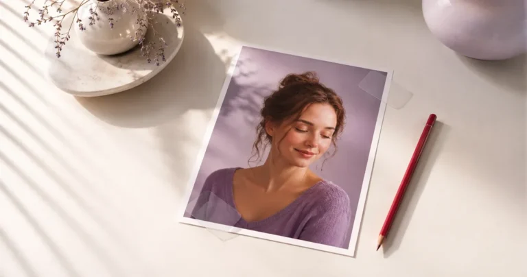
“Visible skin texture and fine lines” is the antidote to the airbrushed look that gives portraits away, and asking for grain and documentary style pushes further from the glossy default. Specific age and physical detail also help: vague human descriptions produce the uncanny composite faces that models reach for when you don’t tell them who this person is.
A social graphic with readable text
Three things make text work: keeping it genuinely short, putting the exact wording in quotes, and stating where it goes. Long phrases degrade quickly on every model, so a headline is realistic and a paragraph isn’t. If the words matter more than the image, this is also the case for choosing a typography-focused model, as covered in our model comparison.
Negative prompts: two or three, not twenty
Negative prompts tell a model what to exclude. They’re essential in some tools, optional in others, and almost universally overused.
The pattern people copy is a wall of generic exclusions: “blurry, low quality, bad anatomy, deformed, ugly, watermark, text, jpeg artifacts, worst quality” and on it goes. Testing suggests the opposite works better: two or three highly specific negatives outperform long generic lists, because a long list dilutes the same attention budget your positive prompt is competing for.
Use them for concrete, recurring problems you’re actually seeing. If hands keep failing, exclude extra fingers. If unwanted lettering keeps appearing on signs, exclude text. If you haven’t seen the problem in your own outputs, don’t pre-emptively exclude it.
Prompting is model-specific now
The single biggest change in the last two years: there’s no longer one prompting style. What works in one tool actively underperforms in another, so the advice you read has to be matched to what you’re using.
- Conversational models (ChatGPT-style) prefer natural paragraphs and reward multi-turn refinement. Say what you want in sentences, look at the result, then ask for one change. OpenAI’s own documentation describes this as the intended workflow rather than a workaround.
- Midjourney-style models prefer short, high-signal phrases and respond strongly to reference images. Long prose gets flattened.
- Stable Diffusion family rewards structured, weighted keywords and is where negative prompts matter most.
- Typography-focused models like Ideogram want the exact wording you need rendered, in quotes, kept short.
Which is why copying prompt libraries between tools disappoints so often. If you’re choosing between models rather than optimising for one, our comparison of what each is good at covers that decision.
Getting consistent results across a set
One prompt producing one good image is a small win. The harder problem, and the one that separates casual use from production work, is getting twenty images that look like they belong together.
Three techniques help, in ascending order of effort:
- Freeze everything except the subject. Write one prompt where only the subject changes and every other clause stays word-for-word identical. Same lighting, same lens, same style, same palette. Consistency comes from what you don’t change.
- Use a seed where the tool offers one. A fixed seed makes the model’s random starting point repeatable, so the same prompt returns something close to the same image rather than a fresh interpretation each time.
- Feed a reference image. Most current tools accept one, and it communicates style faster and more reliably than any amount of adjective stacking. This is the single most underused technique in prompting.
Even with all three, expect drift. Matching lighting and colour precisely across a set remains an unsolved problem in generation, which is why the final consistency pass usually happens in an editor rather than in the prompt.
Fix the result, don’t restart the prompt
The most common time-waster is throwing away a prompt that was 80% right and writing a new one from scratch. You lose everything that worked and roll the dice again.
A better loop:
- Name what’s wrong in one sentence. “The lighting is flat” or “she’s too central” beats “it doesn’t look right”.
- Map it to one of the five parts. Flat lighting is technical, awkward placement is composition, wrong mood is style.
- Change only that part. Keep every other word identical so you learn what the change actually did.
- Keep the good ones. Save prompts that worked, with a note on what made them work. That file becomes worth more than any prompt library you can download.
And know when to stop prompting. If the composition is right but the crop is wrong, the colour is slightly off, or you need it at an exact size, those are editing jobs and no amount of re-prompting does them reliably. Generate the scene, then finish it in an editor, which is also where you’d clean up any artifacts the model left behind.
Finish your generated images properly
Crop, colour, resize and export to exact specs. Free, in your browser.
Open the ArtsFlick Photo Editor