How to Make Photos Look Like Film (Without Buying Any)

You can make photos look like film in about ninety seconds, once you know that the effect comes from four specific things rather than one magic filter. Most attempts fail the same way: someone dumps a sepia preset on a crisp digital photo, and the result reads as “old-timey filter” rather than “shot on Portra”.
The difference is that film’s character is chemical, not decorative. Understanding what the chemistry actually did to light explains every adjustment below, and it’s why the same four moves work on a phone snapshot, a portrait, or a street scene.
Why film looks like film
Film captured light with silver crystals suspended in gelatin. Those crystals had physical size, which is why grain exists; they responded unevenly to color, which is why film stocks had signature palettes; and they could never record true black, because a little light always scattered through the emulsion and back off the film base.
Digital sensors have none of those limitations, which is precisely the problem. Perfect, clean, mathematically accurate images are what film photographers spent decades trying to escape. So making digital look like film means deliberately reintroducing the imperfections engineers spent decades removing.
Four adjustments that make photos look like film
1. Lift the blacks
The single most important move. Real film cannot produce pure black; shadows sit at a soft charcoal instead. In the editor, raise the black point or lift shadows until the darkest area is clearly grey rather than void. Watch the histogram: it should stop short of the left edge instead of slamming into it.
Do the same, gently, at the other end: pull the whites down so highlights roll off softly rather than clipping. That compressed range is what people describe as film looking “gentle”.
2. Warm the highlights, cool the shadows
Most beloved consumer film stocks pushed highlights toward yellow-orange and let shadows drift cool. Nudge color temperature slightly warm overall, then, if your editor allows it, tint shadows a touch blue or green. A hint of sunset glaze, not an orange cast: the moment skin turns tangerine, you’ve gone too far.
3. Mute the saturation, unevenly
Film wasn’t saturated the way digital is. Drop overall saturation by roughly 10 to 20%, and note that reds and greens are the usual giveaways: digital greens especially scream “sensor” when left untouched. The goal is colors that look remembered rather than recorded.
4. Add grain, last
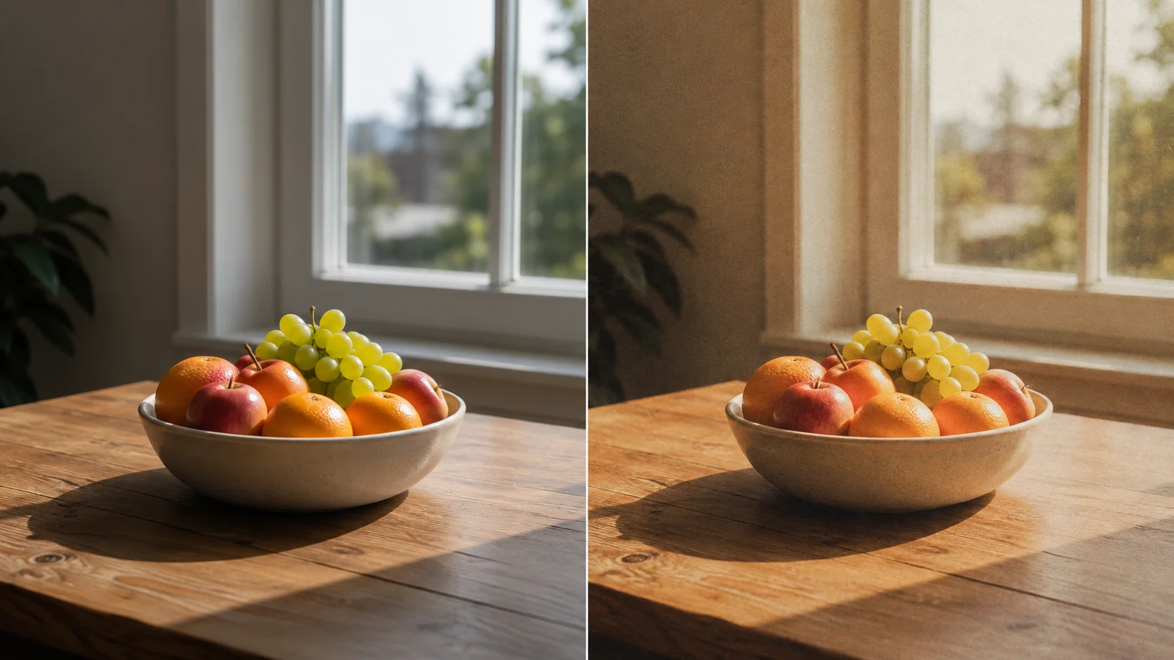
Grain is the signature, and it goes on at the end so it sits over everything else. Keep it fine and even for a low-ISO daylight feel, coarser for a pushed, night-time look. The test: at 100% zoom the texture should be visible; at normal viewing size it should register as atmosphere rather than as noise.
Three recipes worth stealing
Everyday 35mm (the safe one)
Blacks lifted moderately, temperature slightly warm, saturation down 15%, fine grain. This is the look most people mean by “film”: clean, warm, gently faded. It flatters portraits, food, and travel photos, and it’s almost impossible to overdo.
Expired film (moodier)
Blacks lifted further, a stronger warm-to-red shift, saturation down 25%, coarser grain, and a slight green cast in the shadows. Expired stock degraded unpredictably, so this look is meant to be a little wrong. Suits overcast days, cities, and anything you want to feel like a memory.
Lo-fi and lomo (the loud one)
Heavy vignette, strong saturation on a couple of channels, coarse grain, and cheerfully inaccurate color. Toy cameras were plastic-lensed and light-leaky, and the aesthetic celebrates it. Best on high-energy scenes; disastrous on formal portraits.
Using filters as shortcuts (and where they fall short)
Presets get you 80% there in one click, which is the right trade when you’re editing a batch. In the ArtsFlick editor, the film-relevant filters group roughly like this:ong question. The generator handles what doesn’t exist; the editor handles what must.
|
Look you want |
Start with |
Then adjust |
|
Everyday 35mm |
Vintage, Warmth |
Add Noise, lift blacks |
|
Expired film |
Redscale, Twenties |
More grain, drop saturation |
|
Faded print |
Solange, Haze, Evening |
Lift blacks further |
|
Golden-hour warmth |
Sunset, Rosetint |
Ease saturation back |
|
Cool/moody |
Cool Twilight, Blues |
Warm the highlights slightly |
|
Lo-fi damage |
Grime, Offset, Lines |
Use sparingly |
Where presets fall short: they apply the same numbers to every photo regardless of its exposure, so a filter that flatters a bright beach scene will crush a dim indoor shot. Treat the preset as a starting point and finish with the sliders, especially the black point, which varies most from photo to photo.
Try the film look in your browser
Filters, grain, and manual tone controls. Free, no install, no watermark.
Try the ArtsFlick Photo EditorA word on stock names (and why they matter less than you think)
Search this topic and you’ll drown in stock names: Portra 400, Ektar, Cinestill 800T, Tri-X. Presets get sold as faithful emulations of each, and the good ones genuinely are close, since different film stocks really did have distinct color responses baked into their emulsion layers.
But the names matter less than the family. Portra-style stocks were built for skin: warm, low contrast, forgiving. Ektar-style stocks were built for landscapes: punchier, cooler, more saturated. Tungsten-balanced stocks like Cinestill shift everything blue-cyan because they expected artificial light. Learn those three tendencies and you can approximate any of them with the four adjustments above, rather than hunting for the exact preset someone named after a discontinued film.
The one thing worth borrowing from stock culture is consistency. A photographer shooting a roll got the same look across all 36 frames, whether it suited each scene or not, and that uniformity is a big part of why film sets feel cohesive. Pick one recipe per shoot and resist tuning each photo individually.
Which photos actually suit the film look
The treatment is not universal, and knowing when to skip it is half the skill.
- Works beautifully: portraits in natural light, golden-hour scenes, street photography, film-friendly subjects like old cars and cafés, anything you want to feel nostalgic.
- Works badly: product photos (marketplaces want accurate color, as our listing requirements guide covers), documentation, real estate interiors, anything where the viewer needs to judge true color.
- Depends entirely: weddings and events, where a consistent film look across a set can be gorgeous but a half-applied one looks like a mistake. Commit to the whole gallery or none of it.
Five signs you overdid it
- Skin has gone orange. The most common failure. Warm the highlights, not the faces.
- Grain is visible at thumbnail size. That’s noise, not grain. Halve it.
- The whole image is hazy. Lifting blacks is a shadow adjustment, not a wash over everything; contrast should still exist in the midtones.
- The vignette announces itself. If you can see where it starts, it’s too strong.
- Every photo in the set looks different. Film’s charm is consistency: one stock, one look. Pick a recipe per batch and stick to it.
One export note: grain and heavy compression fight each other, since compression treats fine texture as noise to discard and produces muddy patches instead. Export at higher quality than usual, and see our guide on compressing images properly if the file needs to go on a website.