How to Resize an Image Without Losing Quality
You resized a photo, and now it looks worse. Softer, blockier, or stretched in a way you can’t quite name. It happens to everyone, and the frustrating part is that the fix is rarely explained. To resize an image without losing quality, you don’t need expensive software. You need to know which direction you’re resizing, what your editor does behind the scenes, and where the real damage usually comes from (spoiler: it’s often the file format, not the resize).
This guide covers the full picture: a workflow you can reuse for any photo, honest limits on how far you can enlarge, and a size chart for every major platform that’s current as of July 2026. Instagram quietly changed its preferred post shape, so if you’re still designing square-first, that section alone is worth your time.
Why quality disappears when you change image size
Nearly every photo is a raster image: a fixed grid of colored squares called pixels. A 3000-pixel-wide photo contains exactly 3000 columns of them. No software can recover detail that the camera never captured; it can only rearrange or guess.
Two operations cause almost all visible damage:
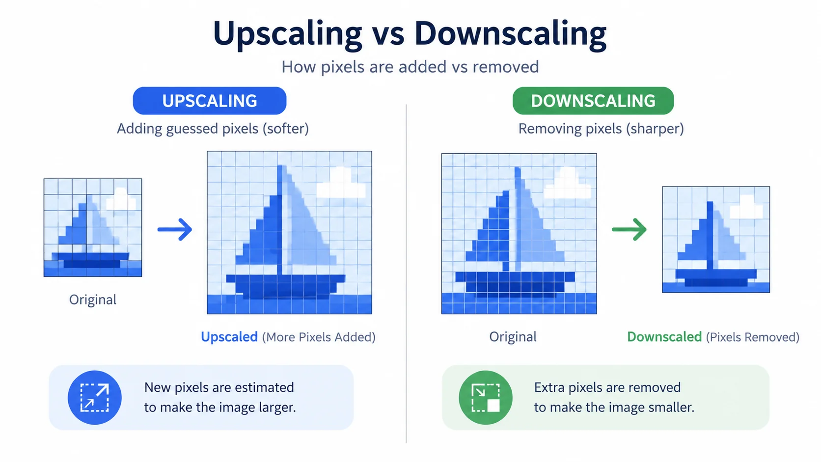
- Enlarging. Going from 800 px to 2000 px wide forces the software to invent over five times as many pixels as it started with. Invented pixels average out their neighbors, which reads to your eye as blur.
- Repeated lossy saves. JPG is a lossy format. Each save throws away a little data to keep the file small. Open, edit, save, repeat, and the artifacts compound. The tenth save looks visibly worse than the second.
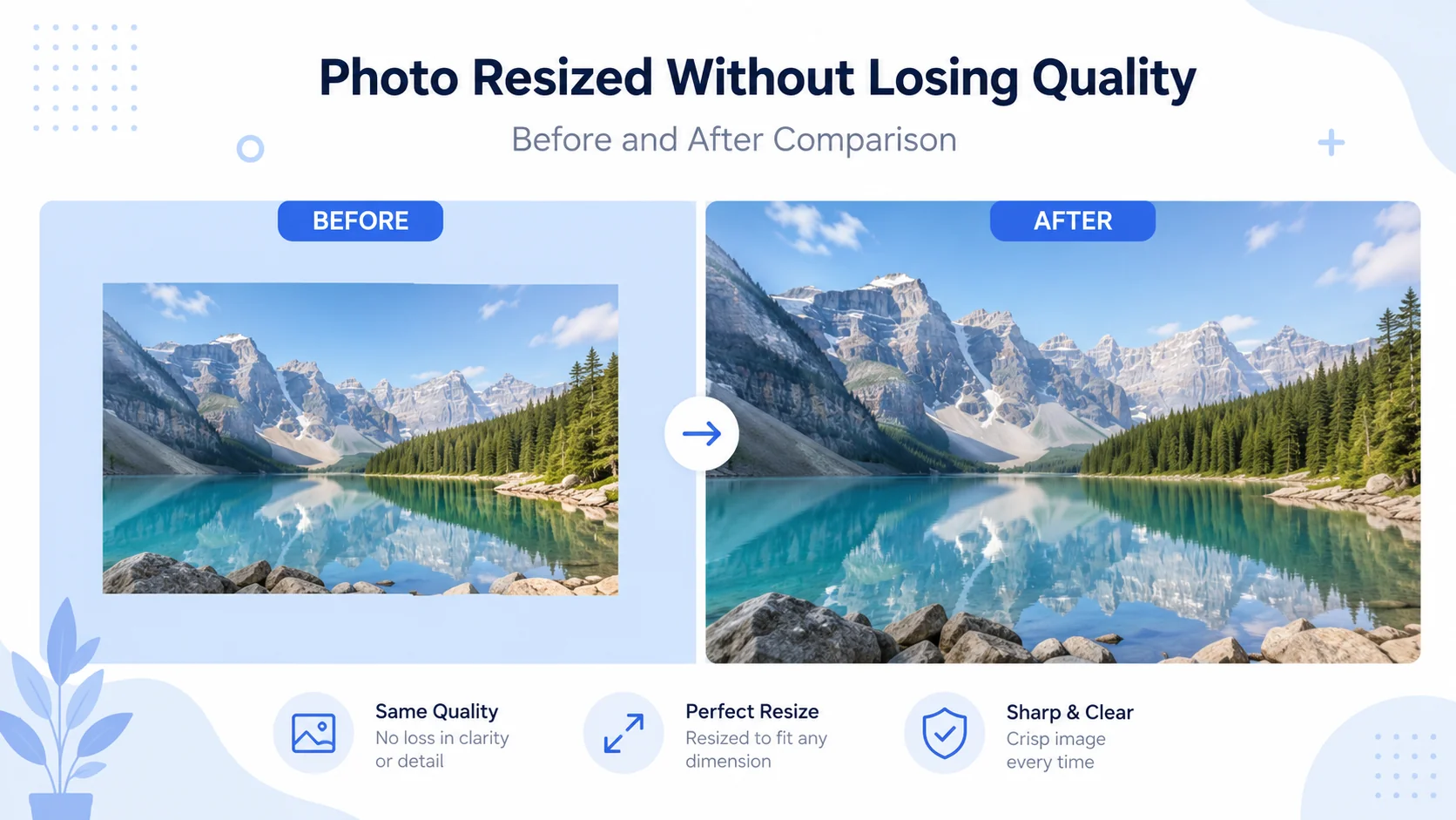
Shrinking, on the other hand, is the safe direction. When you scale a 4000 px photo down to 1200 px, you’re discarding pixels you didn’t need. Done with decent resampling, the small copy looks every bit as crisp as the original. So the first question to ask before any resize is simply: am I going up or down?
Resize, resample, compress: three words people mix up
These three terms get used interchangeably, and the confusion causes real mistakes.
Resize
Changing the pixel dimensions. 4000 × 3000 becomes 1200 × 900. This is the thing you ask for.
Resample
How the software calculates the new pixels, using math called interpolation. Bicubic looks at surrounding pixels to compute each new one, which is why it produces smoother results than crude methods. Lanczos is a step sharper again. Most good editors default to one of these for photos, and the default is usually right. The one to avoid for photos is nearest-neighbor, which keeps hard pixel edges and only makes sense for pixel art.
Compress
Shrinking the file size in kilobytes, not the dimensions. That’s the quality slider on export. Push it too low and you get muddy blocks around edges and text, even if you never touched the dimensions.
How to resize an image without losing quality: 7 steps
This is the workflow I use for every photo that leaves my machine, in artsflick or any other editor.
- Find the largest original you have. Check your camera roll, cloud backup, or the email attachment before settling for a screenshot. Every step after this one works better with more pixels to start from.
- Pick the exact target in pixels. Not “smaller,” not “medium.” A real number, like 1200 px wide for a blog image or 1080 × 1350 for an Instagram post. The chart below has the common ones.
- Lock the aspect ratio. The chain-link or “constrain proportions” toggle keeps width and height moving together. Leave it on unless you’re deliberately cropping to a new shape.
- Go down, not up, whenever the choice exists. If your original is bigger than the target, you’re in the safe zone and the result will be sharp.
- Trust high-quality resampling. Bicubic or Lanczos, which is what most editors use by default. Don’t switch to nearest-neighbor for photos.
- Export in the right format at a sane quality. For photos, JPG at 80–85% quality holds detail well while cutting file size dramatically. In practice I’ve found 85% is the point where side-by-side comparison with the original stops being easy. For graphics or transparency, use PNG or WEBP.
- Inspect at 100% zoom before publishing. A zoomed-out preview hides sins. View the actual pixels. If edges look clean at 100%, they’ll look clean everywhere.
One ordering rule worth engraving somewhere: resize first, compress second, and do both exactly once, exporting fresh from the original each time you need a new copy.
Resize in your browser, free
Set exact pixel dimensions, keep the ratio locked, and export at the quality you choose.
Try the ArtsFlick Image ResizerHow far can you actually enlarge an image?
Here’s the part most guides dodge: real numbers on upscaling limits.
With classic interpolation (the standard resize in any editor), quality degrades noticeably beyond about 2× the original dimensions. Doubling a clean 1000 px photo to 2000 px is usually acceptable at normal viewing distance. Pushing to 3000 px and beyond gives you soft edges and smeared texture, because two-thirds of what you’re looking at was guessed.
AI upscaling moves that ceiling, not removes it. Instead of averaging neighbors, a trained model predicts what the missing detail probably looked like: it rebuilds hair strands, fabric weave, and letter edges rather than blurring across them. In practice, AI handles 2× to 4× enlargements convincingly. A 640 px product shot can genuinely become a usable 2500 px image.
The honest caveats: AI output can look plasticky on faces, occasionally invents texture that was never there, and can’t rescue an image that’s tiny and heavily compressed. A 200 px thumbnail will not become a poster, with any tool, ever. If a print shop is asking for 300 DPI at A3, the answer is to find a bigger original, not a stronger upscaler.
Choosing a file format (it matters more than you think)
The format you export decides how much of your careful resizing survives. Quick reference:
|
Format |
Best for |
Compression |
Notes |
|
JPG |
Photos |
Lossy |
Small files, no transparency. Never re-save repeatedly. |
|
PNG |
Graphics, logos, transparency |
Lossless |
Pixel-perfect edges and text; bigger files. |
|
WEBP |
Any web image |
Lossy or lossless |
Typically 25–30% smaller than equivalent JPG/PNG. Supported by every modern browser. |
|
SVG |
Logos, icons, vector art |
N/A (vector) |
Scales to any size with zero loss. Not for photos. |
Two details from that table deserve emphasis. First, WEBP is the default answer for websites now; Google’s WebP documentation puts the savings at roughly 25–34% over JPG at equivalent quality, which translates directly into faster pages. Second, if a logo keeps going fuzzy when you enlarge it, you’re resizing a raster copy of something that should be vector. Ask the designer for the SVG. MDN’s image file type guide is a solid reference when you hit a format question this table doesn’t cover.
Image size chart for web and social media (July 2026)
Resizing is easier when the target is a known number. These are current as of July 2026; platforms adjust specs every year or so, which is exactly why we date this table.
|
Where it’s going |
Size (px) |
Worth knowing |
|
Instagram post (portrait) |
1080 × 1350 |
The 4:5 portrait is now Instagram’s preferred feed shape, so design portrait-first. |
|
Instagram post (square) |
1080 × 1080 |
Still works, but gets less screen than 4:5. |
|
Instagram / Facebook story, Reels, TikTok |
1080 × 1920 |
Keep text ~250 px away from top and bottom edges (UI overlays). |
|
YouTube thumbnail |
1280 × 720 |
Max file size 2 MB. |
|
Facebook cover photo |
851 × 315 |
Displays ~820 × 312 on desktop, 640 × 360 on mobile, so center the subject. |
|
X (Twitter) header |
1500 × 500 |
Only the middle ~1250 × 400 is safe from cropping. |
|
LinkedIn personal banner |
1584 × 396 |
Your profile photo covers the lower left. Keep that corner clear. |
|
Full-width website image |
~1920 wide |
Enough for most desktop screens without waste. |
|
Blog inline image |
~1200 wide |
Compress to comfortably under 200 KB where you can. |
And a note the size charts rarely include: don’t upload a 5000 px photo just because the platform accepts it. The platform will recompress it with settings you don’t control. Deliver the exact display size yourself and you keep that decision.
Mistakes that quietly ruin your images
- Enlarging past the limits above and hoping. If the source is small, budget for 2× (classic) or 4× (AI) and plan around that.
- Editing the only copy. Keep one untouched original per photo. Every export should be a fresh copy from it, so mistakes cost nothing.
- Saving JPG over JPG over JPG. Generational loss is real and it compounds. This is the slow leak that makes year-old images look worn out.
- Accidentally unlocking the aspect ratio. The result is subtly stretched faces that viewers notice before they can say why.
- Wrong format for the content. JPG smears logo edges; PNG bloats photos to several megabytes. Match the format to the content, not habit.
- Skipping the 100% zoom check. Thirty seconds of inspection catches what an hour of re-editing would otherwise fix later.